Creating Illustrations for a Children's Book - Starting the Paintings

I am working on creating 17 illustrations for a children’s book, “For I Am Yours” written by author Pauline Hawkins. This is the second post of my journey to create the illustrations. I have not illustrated a book before and I thought I would blog about the process. The first blog post in this journey is linked here: Creating Illustrations for a Children’s Book

Fabriano Hot Press paper - Click to Enlarge

Yesterday, I started painting two of the pages on Fabriano 140 lb. hot press paper. I have used this paper for other paintings and really like it for ink and watercolor. However, while painting one of the figures in the story, I tried to make a change by lifting some color off with a stiff brush and because the Fabriano is a soft paper, the paper surface became marred. My usual substrate, Arches watercolor paper, can handle a lot of rougher techniques like: lifting, masking, and scrubbing. So, I decided instead of struggling with the Fabriano throughout this process, I would go back to the Arches paper.

Masking Fluid - Click to Enlarge

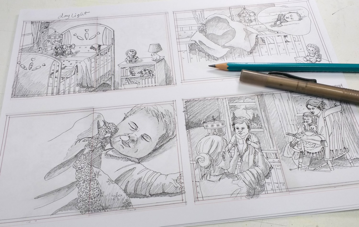
After deciding to change back to Arches 140 lb. cold press paper, I began with pages 3 and 4 because there are no figures, accept toys, on this double spread. So, I could get used to my process for the illustrations without the extra pressure of painting a figure. My paper was stretched and dried overnight. I taped the edges down to help hold the paper a little more firmly while painting some of the wetter areas. Then I masked some of the shapes with masking fluid to protect them while painting.

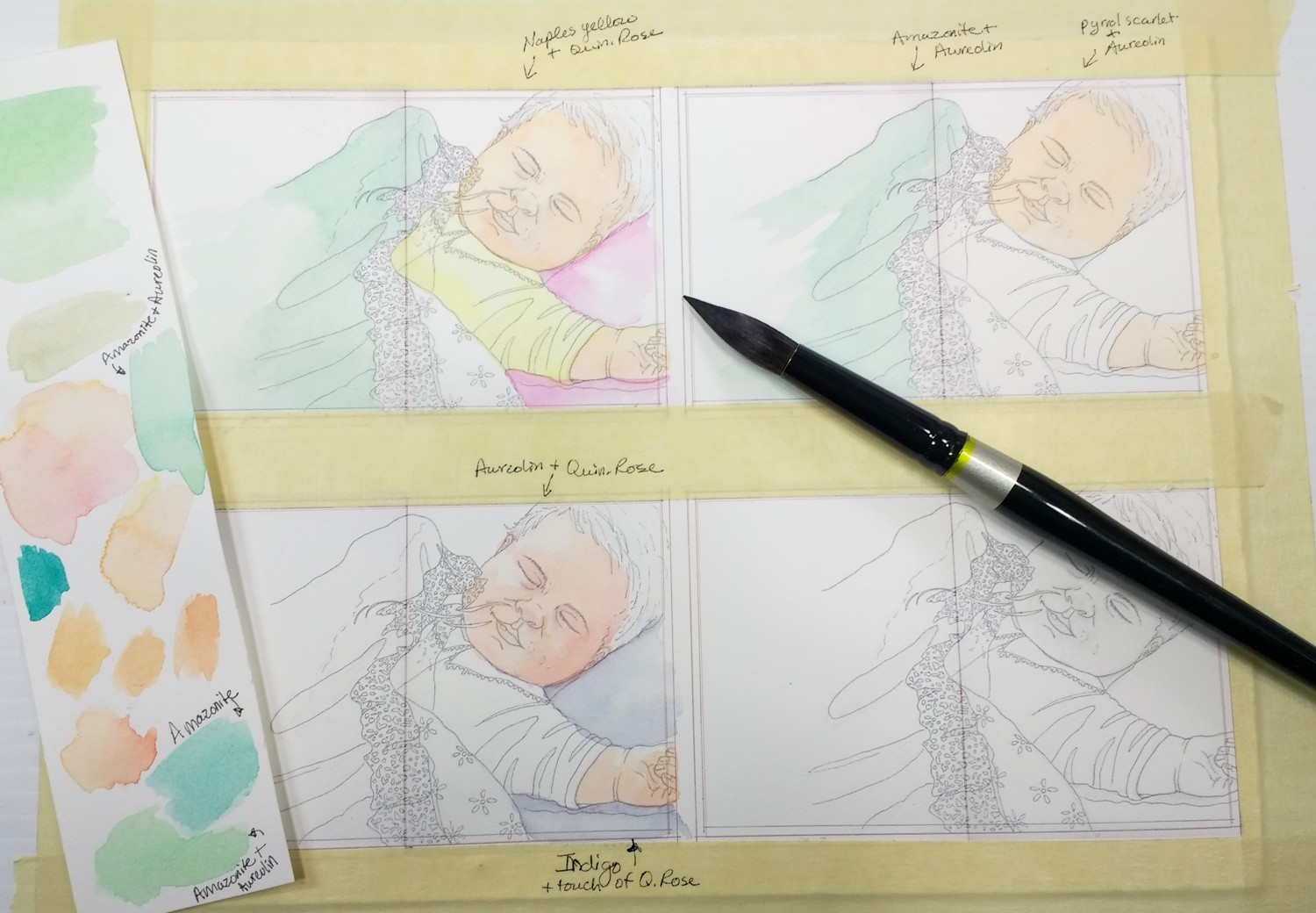
Mixing Colors - Click to Enlarge

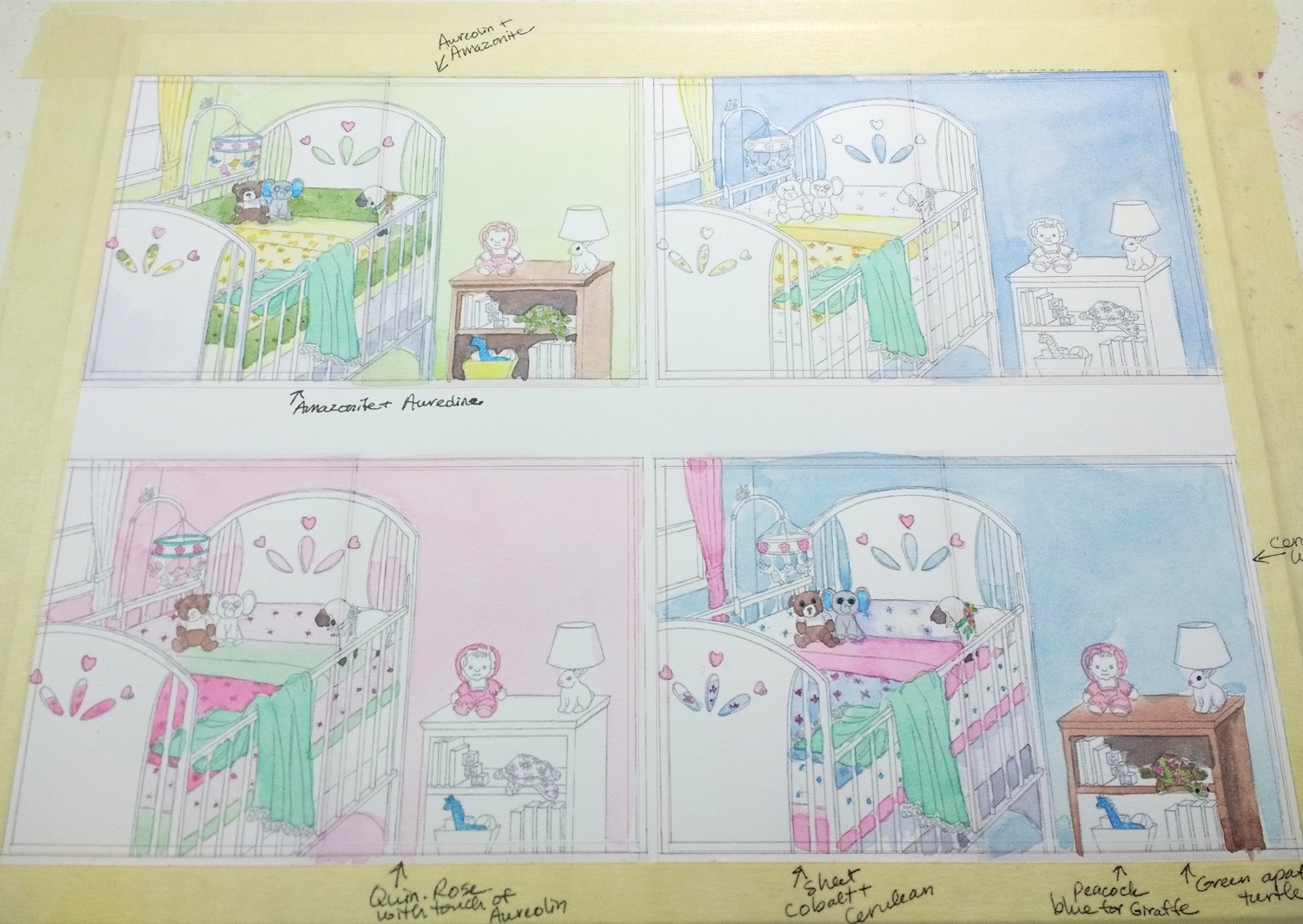
Before starting the painting, I mixed a large amount of the color for the wall color in the baby’s room and a smaller amount for the blanket. I mixed the colors in some jars with lids to hopefully have enough to use for all the pages of the book. I used a mix of Amazonite Genuine by Daniel Smith (the aqua color) and Aureolin Yellow for both colors. There is more yellow the wall color and more Amazonite in the blanket color.

I began painting the bedroom walls on dry paper because I didn’t want to lighten the color I had premixed. This is a different way to work because I usually mix the color I need as I am working on a painting. Once the wall color was dry, I started painting some of the other objects in the room. I am making up the scenes, so I have to imagine where the light is coming from and how that will affect the objects. I will be adding layers and making adjustments as I go.

I have 3 other pages drawn and stretched onto the Arches watercolor paper. I will start painting portions of these that repeat from this first image like: the blanket, walls, stuffed animals, etc. That way I can get a production line going.

I have one video on my Youtube channel so far and will continue to film and post others. And you can check out Pauline Hawkins’ blog post - “For I Am Yours: The Story Behind the Story”.

First Layers - Click to Enlarge

Beginning and Basic Watercolor Supply List by Lorraine Watry

The following list of beginning and basic watercolor supplies is what I give to my beginning students and as a basic list for some of my classes. Sometimes I add to or subtract some supplies depending on the class or workshop. You can see a more in-depth talk about watercolor supplies on my Youtube channel - Lorraine Watry or click this link for the first video: Watercolor Supplies Part 1 of 4

The one thing that I do recommend to all of my students is that they buy artist or professional grade watercolor paint and paper because it really makes a difference when working with watercolor. It may seem like they could save some money when buying watercolor supplies by buying the student grade paint and paper, but because these student grade supplies don’t work the same the students end up getting frustrated.

Click to enlarge

The student paper is often made of wood pulp and can’t handle the same techniques. This paper also dries a lot faster and that will cause streaking and blooms to happen more readily. The student grade paper often tears when using masking tape or masking fluid to protect areas until we are ready to paint them.

Click to enlarge

Student grade paints are another problem. Students will often buy the cheaper, student grade pigments. However, these paints include a chalky filler to extend the pigment in the mix and make them less expensive. The chalky filler will make these paints less vibrant and more opaque compared to professional watercolor. Students may have paid less for the student grade paint, but they tend to use more of it because they are trying to get the same intensity as I get with my professional paint.

Watercolor paint is unlike acrylic and oil paint because it can dry out and be re-wet. You don’t throw it out like you do with acrylic or oil after they have hardened. So, it takes a long time to go through a tube of professional or artist grade watercolor.

The brushes are the third basic watercolor supply that can make a difference in how easily it is to learn and work with watercolor. The most important thing is to get brushes made for watercolor not acrylic or oil brushes. There are better and better synthetic watercolor brushes, three brands that are decent are Princeton Neptune, Golden Fleece by Cheap Joes, and Grey Matters by Jack Richeson. My current favorite brushes that cost a little more than synthetic brushes are a brand called Silver - Black velvet. These brushes are a blend brush made with half synthetic bristles and half natural hair.

Main Supplies:

Watercolor Paper:

  • 1 or 2 sheets (22x30) of 140 lb., cold press, Arches or Fabriano watercolor paper or a watercolor paper block (a block is a bound tablet of paper, 10”x14” would be fine)

Click to Enlarge

Watercolor Brushes:

  • At least two round watercolor brushes that come to a good point - a size #16 or larger and around a #6 to #8 (If you have other brushes, please bring them. My current favorite brushes are a #16 or #20 blend (½ synthetic/½ natural) - Silver Black Velvet brushes (a little more expensive), or a #8, Quill by Princeton Neptune (less expensive). A small flat #2 or #4 brush is good to have, too.

Watercolor Paint:

  • If you can only afford 3 or 4 tubes, please get Ultramarine Blue or Cobalt Blue, Quinacridone Rose, Aureolin (Cobalt Yellow), and Burnt Sienna. I found a set of Daniel Smith colors on Amazon that works great plus a small tube (5ml) of Burnt Sienna. If you have time to order it and have it shipped before the class, the set is 6, 5ml tubes: Daniel Smith Extra Fine Essentials Introductory watercolor If you already have paint or can purchase others, these are good to have: Cobalt Blue, Cadmium Red or Pyrrol Scarlet, Lemon Yellow or Hansa Yellow Light, New Gamboge, Quinacridone Gold, Sap Green, Quinacridone Magenta, Manganese Blue or Cerulean Blue (I use mainly Daniel Smith paint, but also Holbein, Daler Rowney, and Winsor & Newton)

Other Supplies:

Click to enlarge

Click to Enlarge

  • A board to tape or staple your paper to, don’t need if buying a watercolor block. I use Gatorboard or gatorfoam - 1st (foam core with a hard surface) or a white, corrugated plastic sign (for garage sales from Home Depot or Art store might carry this) - 2nd

  • Something to lean your board on, that is about 2 1/2" to 3" high. (Some students have used a tuna fish can, flattened roll of paper towels, piece of styrofoam etc.)

  • Palette or white plastic plate 8” or larger (A good starter option - Creative Mark Folding plastic Palette ($4-$7) http://www.jerrysartarama.com/folding-plastic-palette)

  • Masking tape (I use the High Adhesion masking tape by Scotch from Home Depot's paint department. It says 'High Adhesion' inside of the roll and Pro Painter on the box, I think.) (See Image Below)

  • Removable Masking fluid or frisket (make sure it doesn’t say ‘permanent’. I use the Windsor and Newton, colourless art masking fluid.) Do Not shake masking fluid! (See Image Below)

  • Paper towels (I use Viva brand, extra absorbent and hold up well and NO texture)

  • TWO water containers (plastic or glass, should be about 5” or 6” high and around a 3” opening)

  • Spray bottle (bottle that you can adjust the spray to get bigger drops of water, not mist)

  • Pencil #2 and white or kneaded eraser

  • Sketch book (5”x7” or bigger, can be one you already have used)

Click to enlarge

If you have time you can order your supplies by mail, some good online art supply stores in the United States are: (I compare prices to get lowest)

Cheap Joes - www.cheapjoes.com

Jerry’s Artarama - www.jerrysartarama.com

Dick Blick - www.dickblick.com

or Amazon.com (has some supplies)

Click to Enlarge

Creating Illustrations for a Children's Book

In 2015 I was asked by author, Pauline Hawkins, to create the illustrations for a children's book that she wrote when her daughter was little. We started the process and then both our lives got busy and now we're getting back to it. I will be creating 17 watercolor illustrations to tell the story from the blankets point of view. The blanket is a metaphor representing the love of mothers for their children. As the child grows she needs her blanket less and less, but the blanket will always be there for her, protecting and loving her.

I have not created illustrations for a children’s book before, so I am learning as I go. I started with small mock-ups, about 2 1/2” x 3 1/2”, to sketch the story out. Pauline has modified the story a few times now, so a few of the images have changed or were deleted. Since I will be painting the illustrations with watercolor, I wanted to make sure the drawings are exact before starting the paintings. Watercolor is not an easy medium to make changes to. Changes are possible, but if I can avoid having to make adjustments, that would be preferred.

I asked Pauline for images of her daughter when she was little and the little girl is a combination of her daughter and some images of my daughter. I also looked up poses to use for some of the illustrations since I didn’t have photos of the actual scenes. The stuffed animals that inhabit the little girls room are from Pauline’s two kids and my three kids. I enjoyed placing them around the scenes as secondary characters. I also decided to include a butterfly in almost every scene for the young readers to search for when reading the book.

Images drawn on Borden & Riley Paper and inked

Images drawn on Borden & Riley Paper and inked

I wanted to keep the illustrations interesting, so some of the scenes are viewed from overhead or from a lower or higher perspective. After doing the initial sketches, I began drawing the images full size 9”h x 7”w for a single page or 9”h x 14” for a double spread (23 x 18 cm or 23 x 36 cm). I draw on Borden and Riley, #234 Bleed Proof Paper for pens because I like the weight of it and it doesn’t smear when I run my hand across it. After I finished the drawings and started inking them in so that the lines would be dark enough to transfer to my watercolor paper using a light table.

This is also my process when I do any of my watercolor paintings. It might take longer to create the drawing, ink it, and then transfer it, but there are several reasons why I do this.

1. I do my drawing on a separate piece of paper because I can erase and make changes before transferring it to my watercolor paper. It is better not to erase a lot on watercolor paper so that you don’t damage the surface.

2. By doing the drawing on a separate piece of paper, I can easily re-draw the image if I have an issue while creating the painting or if I want to enlarge or reduce the image before transferring to the watercolor paper I can do that.

3. Because I have drawn the image three times by the time I have transferred it to my watercolor paper , I sometimes see things I want to adjust and I am more familiar with the image prior to painting.

Small drawings printed out and shaded

Small drawings printed out and shaded

For the book, I decided to scan my inked drawings and using my Corel Draw graphics program, I reduced the drawings to fit 4 images per piece of printer paper. Then I printed them out and shaded the images to give myself information on the location of light and shadows in the scenes.

Illustrations printed on watercolor paper

Illustrations printed on watercolor paper

The next thing I did was to print some of the images onto watercolor paper using my Epson WF-4734 printer. This printer uses the Epson Durabright ink. This ink is waterproof so I can paint on top of it without it smearing. I was able to print on some 140lb, Fabriano hot press watercolor paper. It depends on your printer whether it will handle printing on this thicker paper. I then tape the watercolor paper onto some gatorfoam board.

I decided to start with the baby to get an idea of the colors I wanted to use. I tried different color combinations for the babies skin and some some of the materials. The blanket will be a minty green and I decided I like a mix made with Amazonite Genuine by Daniel Smith and Aureolin Yellow to make the green. I didn’t feel the need to do all the shading and values in these color studies, because I will do that on the actual paintings.

Four versions of the baby color studies

Four versions of the baby color studies

I ended up liking the bottom left version of the baby. I am also trying to decide if I want to use the Fabriano hot-press paper or use Arches cold-press. Normally I paint on Arches 140 lb. cold press paper. I like the fact that Arches is able to handle a lot of techniques including lifting. That might come in very handy if I have to change something in one of the children’s book illustrations. Fabriano is a slightly softer paper and is brighter white. I like the look of it, but I may not be able to use some of the techniques because the surface can tear with rougher techniques. I accidentally dropped some yellow watercolor on the green blanket, but was not concerned about lifting it back off since it is just a study.

Close-up of the baby using Aureolin Yellow and Quin. Rose for pinker skin

Close-up of the baby using Aureolin Yellow and Quin. Rose for pinker skin

Right now, my lines really show. I am trying to decide if I want to use any other medium with the watercolor, like ink or watercolor pencil to give the illustrations a distinct character.

Childrens-book-illustrations-color-study-room-by-Lorraine-Watry.jpg

Next, I painted four versions of the babies bedroom to get an idea of the color scheme. I could probably do a dozen versions of the bedroom color scheme, but I ended up liking the warm look of the upper left bedroom with the yellow and green with touches of blue and pink. I explain my process for the bedroom color schemes in the video below.

I will continue to post my process and progress as I work on the illustrations for the book in the next couple of months. So, please check back.