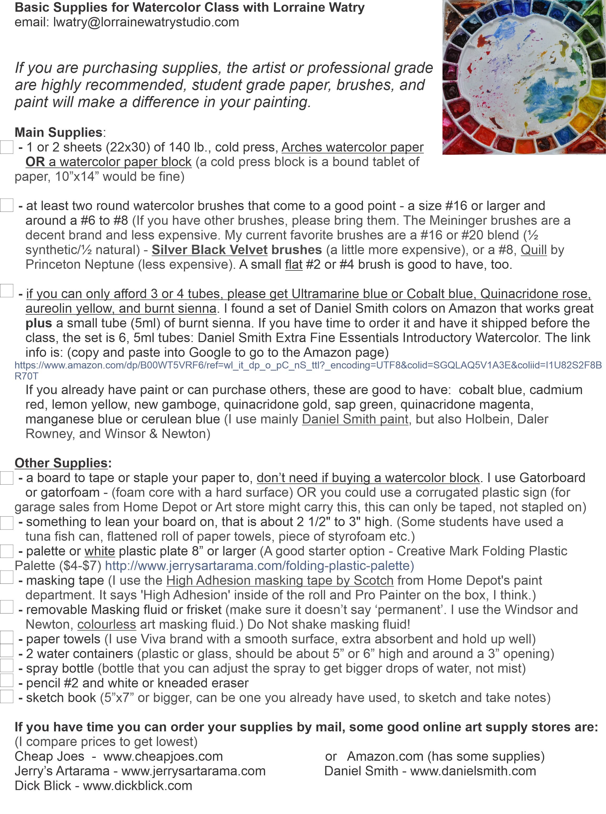
Basic Supply List for Watercolor

I thought it might be helpful to post my Basic Watercolor Supply List. The items on this list are things I like my students to have. Different instructors might suggest other items or quantities. As I say at the top of the list, I feel it is important to buy professional or artists grade paper and paint because the student quality can really cause issues with learning and using watercolor.

If you need to purchase items slowly, then I would get one piece of 100% cotton watercolor paper from Arches or Fabriano. There are other professional brands, but these are readily found. You can cut it up into smaller pieces and use both the front and back.

Also, if you can only get a few tubes of paint to start, I would purchase Ultramarine Blue, Quinacridone (Quin.) Rose, Hansa Yellow Light, and add Burnt Sienna when you can. These four tubes of paint will give you a wide variety of colors by mixing them.

I hope this watercolor supply list is helpful.

1 New Basic Supply List - for website blog post.jpg

The Colors on My Watercolor Palette

I have questions about the colors that are on my watercolor palette every now and then. So, I thought I would do a post showing my palette layout and the watercolors I currently have on my palette.

A Note About my Palette:

This palette of colors works well for the kind of paintings that I like to do. However, they may not be the colors that you or many other watercolorists would want on their palettes. Any time a teacher suggests or requires colors for a painting or class, it is a good idea to decide if you really need to add them to your palette. You may try their suggestions and find a new color that you really like or you may spend a lot of money going from one set of colors to the next. At some point it is a good idea to limit the colors you are working with and really investigate the mixes and techniques that you can do with those colors.

Starting with a Limited Palette:

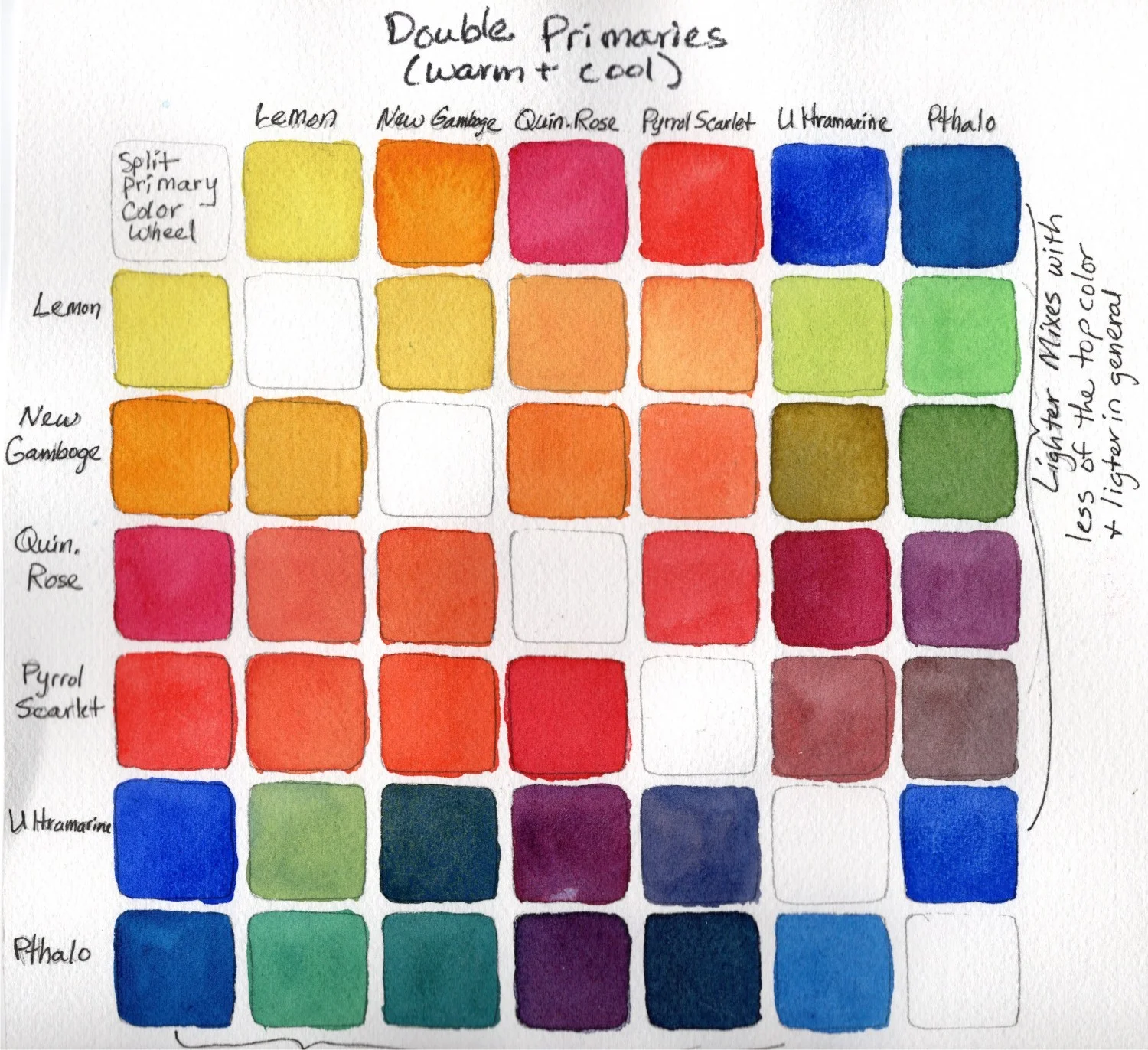
Just because I have all of these colors on my palette now, does not mean that I started watercolor using this many pigments. If you are just starting out, one of the best things you can do for yourself is to start with a limited palette and really learn what those colors can do and how they mix together. A suggestion for a 4 color limited palette might be - Cobalt, Quinacridone Rose, and Hansa Yellow Light (or Lemon Yellow), and Burnt Sienna. If you want to expand a little more, I would suggest a 7 color limited palette that has a ‘warm’ and ‘cool’ version in each color family, plus brown. This 7 color palette would be - Ultramarine Blue (cool) & Phthalo Blue (warm), Quinacridone Rose (cool) & Pyrrol Scarlet (warm), Hansa Yellow Light (cool) & New Gamboge (warm), and Burnt Sienna. With these 7 colors you can make a huge variety of mixes including secondaries, grays, browns, and blacks.

The Kind of Palette That I Use:

I use a Stephen Quiller Palette. It is 15”x15” and comes with a lid. They also have a porcelain palette, but it is heavier and more expensive. The other difference is the porcelain palette has a few less paint wells than the plastic palette. Over time my plastic palettes do crack and I will replace them periodically.

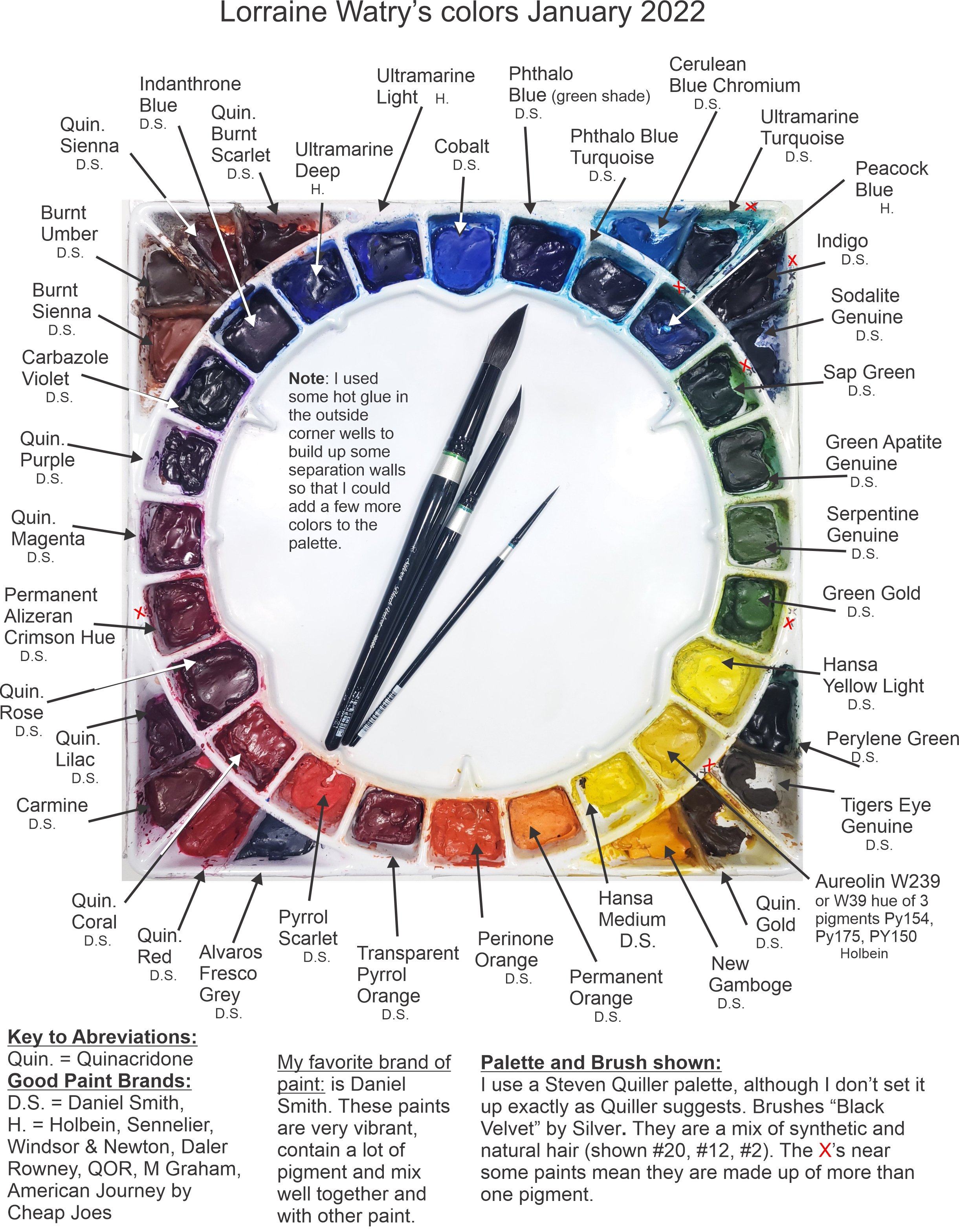
Here is the current layout of my Watercolor Palette as of January 2022:

How I Layout My Palette:

Stephen Quiller has a method to layout this palette with specific colors that he uses in his paintings and that work well for making mixes. I, however being the rebel I am, don’t use the palette with Mr. Quiller’s setup or pigment choices.

I like this palette because of the large center mixing area and the number of wells (32) available for my paint. You may notice that there are more than 32 wells on the image above. I decided after using the palette for a while, that I could divide the corner wells by using some hotglue to create dividers. The lower left (red corner) shows the wells without the hotglue added. The other three show the extra wells I made to add 6 more wells. I drew a line with the hotglue, let it dry, and then added the next line of hotglue until I had the divider tall enough.

My palette colors have changed over time. I tend to keep using the same colors for a year or two. If I haven’t used a color in that time, then I might change it out for something new. My palette slowly morphed into this layout with a few recent changes.

I lay out my palette with a color wheel in mind. The colors are in their color families - blues, greens, yellows, oranges, reds, etc. The longest pointed well at the top contains Cobalt blue. It is the color I use as my Primary blue. Others consider Ultramarine or Phthalo Blue as the primary blue. In the longest pointed Yellow well, I have Hansa Yellow Light as my Primary Yellow (in place of Lemon Yellow), and Quinacridone Rose in the Primary well for the reds.

Then I lay out the other colors between them. ‘Warmer’ reds are on the right side of Quinacridone Rose toward the oranges and the ‘cooler’ reds are on the left side of Quinacridone Rose toward the purples. I continue this process for the other color families. There are a few oddball colors in the corners, like some browns and dark colors like Indigo and Sodalite Genuine.

The Pigments I use:

Most of the pigments I have on my palette now are from Daniel Smith. I also have a few pigments from Holbein. I used to use a variety of brands, but over time slowly changed to Daniel Smith because I like how easily their paints re-wet after drying, how full of pigment they are, and the large variety of colors. The Holbein colors I have on my palette are ones that Daniel Smith doesn’t have or that I like better in the Holbein brand for various reasons.

I have noted under each of the pigment names what brand they are with a D.S. for Daniel Smith and an H. for Holbein.

The other aspect of the pigments on my palette is that they are transparent to semi-transparent. I don’t like to use opaque pigments because I like the transparency and glow of the paper through the paint.

Use This or Other Palette Layouts as a Jumping off Point:

I have created a YouTube video that goes over the layout of my palette, why I chose certain colors, and some of my favorite mixes. Here is the link for that YouTube video - Tip #17 My Watercolor Choices and Mixes.

I know some watercolor teachers that don’t share the colors they are using. They may not want to give away how they make their mixes or they want the students to investigate and learn what the pigments do without influence from the teacher.

I see sharing my colors as a jumping off point for students and I don’t mind sharing the colors that I like to use. I hope that the students will explore other pigments and find the colors and mixes that work best for them.

Children's Book Watercolor Illustrations - The Process By Lorraine Watry

Blankie Meets Baby

I am behind on my blog but I have a lot more of the illustrations for the children’s book, “For I Am Yours”, completed. For those that are new to my blog, I am creating 17 watercolor illustrations for a children’s book written by author, Pauline Hawkins. Some of these 17 illustrations are 9”x7” and some are the double spread and therefore, 9”x14”. The story is told from the blanket’s point of view and, as the baby grows, the blanket is needed less and less. The blanket is a metaphor for a mother’s love.

One of my favorite images so far is early on in the story when Blankie meets Baby for the first time and feels her breath on it’s ruffles. I enjoyed the close up view of the baby and tried to create a peaceful color scheme.

Skin Tones In A Watercolor

I started this watercolor with thin washes of color on the blanket, the babies skin, and the clothing. Then I started building the depth with glazes of the same colors. I use a warm red (Pyrrol Scarlet) with New Gamboge Yellow for the base skin tone on the baby and then start to glaze on more of the same colors for depth. I also use other mixes to cool the skin tone down in places or give it shadow. Some of the mixes I like are: Quinacridone Rose by itself or with a yellow like New Gamboge or Aureolin Yellow, Permanent Alizeran Crimson & Ultramarine blue for the shadows and Pyrrol Scarlet with a tough of Burnt Sienna for warm, darker areas. I also leave some glazes with hard edges and use water to soften other edges after applying them. If there were more dramatic light on the baby, my glazes would be darker and might have harder edges in places.

Applying Masking Tape To Preserve Whites In a Watercolor

Before starting the painting, I used some masking tape on the shapes that would become the baby’s breath. The tape was applied over my pencil line and then cut out. You can see more of this process in my blog post at this link: Masking a Watercolor With Masking Tape. You can see the masking tape in this image because of the darker paint. In this image I have continued to work around the painting. I applied the first layer of color to the hair and used some water toward the upper right corner to soften the hair into that corner. I also used some Indigo while the paint of the hair was still wet to darken the corner. I have started to add shadows. These additions allow me to see how all of the values and colors are working without over committing too soon. So, I take my time and keep building until I feel I have an area completed.

Painting An Illustration Without A Photographic Resource

I was not working from a photo for this image, as is the case for most of the illustrations in this children’s book. Therefore, I am using my knowledge of other paintings to create the light and form of the objects. I purposely kept the light on the babies face a little softer and used harder shadows on the blanket and the fabrics to keep the look of the baby soft and sweet. Whenever, I work on a face, I tend to make adjustments and changes as I go. With watercolor this can be a little tricky. I was happy with this painting, but in one of the later figures, I ended up having to start again because I could not get the facial features to work. To finish this illustration, I removed the masking tape from the shapes representing the babies breath. I then used a small flat brush with a little water to soften some of the edges of the white shapes, so that they would not stand out as much and look more “atmospheric”.

If you would like to see more of these illustrations, please follow along and I will continue to blog about this journey.

Beginning and Basic Watercolor Supply List by Lorraine Watry

The following list of beginning and basic watercolor supplies is what I give to my beginning students and as a basic list for some of my classes. Sometimes I add to or subtract some supplies depending on the class or workshop. You can see a more in-depth talk about watercolor supplies on my Youtube channel - Lorraine Watry or click this link for the first video: Watercolor Supplies Part 1 of 4

The one thing that I do recommend to all of my students is that they buy artist or professional grade watercolor paint and paper because it really makes a difference when working with watercolor. It may seem like they could save some money when buying watercolor supplies by buying the student grade paint and paper, but because these student grade supplies don’t work the same the students end up getting frustrated.

Click to enlarge

The student paper is often made of wood pulp and can’t handle the same techniques. This paper also dries a lot faster and that will cause streaking and blooms to happen more readily. The student grade paper often tears when using masking tape or masking fluid to protect areas until we are ready to paint them.

Click to enlarge

Student grade paints are another problem. Students will often buy the cheaper, student grade pigments. However, these paints include a chalky filler to extend the pigment in the mix and make them less expensive. The chalky filler will make these paints less vibrant and more opaque compared to professional watercolor. Students may have paid less for the student grade paint, but they tend to use more of it because they are trying to get the same intensity as I get with my professional paint.

Watercolor paint is unlike acrylic and oil paint because it can dry out and be re-wet. You don’t throw it out like you do with acrylic or oil after they have hardened. So, it takes a long time to go through a tube of professional or artist grade watercolor.

The brushes are the third basic watercolor supply that can make a difference in how easily it is to learn and work with watercolor. The most important thing is to get brushes made for watercolor not acrylic or oil brushes. There are better and better synthetic watercolor brushes, three brands that are decent are Princeton Neptune, Golden Fleece by Cheap Joes, and Grey Matters by Jack Richeson. My current favorite brushes that cost a little more than synthetic brushes are a brand called Silver - Black velvet. These brushes are a blend brush made with half synthetic bristles and half natural hair.

Main Supplies:

Watercolor Paper:

  • 1 or 2 sheets (22x30) of 140 lb., cold press, Arches or Fabriano watercolor paper or a watercolor paper block (a block is a bound tablet of paper, 10”x14” would be fine)

Click to Enlarge

Watercolor Brushes:

  • At least two round watercolor brushes that come to a good point - a size #16 or larger and around a #6 to #8 (If you have other brushes, please bring them. My current favorite brushes are a #16 or #20 blend (½ synthetic/½ natural) - Silver Black Velvet brushes (a little more expensive), or a #8, Quill by Princeton Neptune (less expensive). A small flat #2 or #4 brush is good to have, too.

Watercolor Paint:

  • If you can only afford 3 or 4 tubes, please get Ultramarine Blue or Cobalt Blue, Quinacridone Rose, Aureolin (Cobalt Yellow), and Burnt Sienna. I found a set of Daniel Smith colors on Amazon that works great plus a small tube (5ml) of Burnt Sienna. If you have time to order it and have it shipped before the class, the set is 6, 5ml tubes: Daniel Smith Extra Fine Essentials Introductory watercolor If you already have paint or can purchase others, these are good to have: Cobalt Blue, Cadmium Red or Pyrrol Scarlet, Lemon Yellow or Hansa Yellow Light, New Gamboge, Quinacridone Gold, Sap Green, Quinacridone Magenta, Manganese Blue or Cerulean Blue (I use mainly Daniel Smith paint, but also Holbein, Daler Rowney, and Winsor & Newton)

Other Supplies:

Click to enlarge

Click to Enlarge

  • A board to tape or staple your paper to, don’t need if buying a watercolor block. I use Gatorboard or gatorfoam - 1st (foam core with a hard surface) or a white, corrugated plastic sign (for garage sales from Home Depot or Art store might carry this) - 2nd

  • Something to lean your board on, that is about 2 1/2" to 3" high. (Some students have used a tuna fish can, flattened roll of paper towels, piece of styrofoam etc.)

  • Palette or white plastic plate 8” or larger (A good starter option - Creative Mark Folding plastic Palette ($4-$7) http://www.jerrysartarama.com/folding-plastic-palette)

  • Masking tape (I use the High Adhesion masking tape by Scotch from Home Depot's paint department. It says 'High Adhesion' inside of the roll and Pro Painter on the box, I think.) (See Image Below)

  • Removable Masking fluid or frisket (make sure it doesn’t say ‘permanent’. I use the Windsor and Newton, colourless art masking fluid.) Do Not shake masking fluid! (See Image Below)

  • Paper towels (I use Viva brand, extra absorbent and hold up well and NO texture)

  • TWO water containers (plastic or glass, should be about 5” or 6” high and around a 3” opening)

  • Spray bottle (bottle that you can adjust the spray to get bigger drops of water, not mist)

  • Pencil #2 and white or kneaded eraser

  • Sketch book (5”x7” or bigger, can be one you already have used)

Click to enlarge

If you have time you can order your supplies by mail, some good online art supply stores in the United States are: (I compare prices to get lowest)

Cheap Joes - www.cheapjoes.com

Jerry’s Artarama - www.jerrysartarama.com

Dick Blick - www.dickblick.com

or Amazon.com (has some supplies)

Click to Enlarge

How to Mix Vibrant Colors in Watercolor by Lorraine Watry

There is a lot to color theory and it can’t all be covered simply or quickly. This post is to give you some generalities to work with when making watercolor mixes and how to mix Vibrant Colors and not Muddy Colors.

When trying to make “Vibrant” color mixes try these tips:

1. The brand and quality of paint you use can and does make a difference on how vibrant your color looks. If you use a student grade paint, it will have chalky fillers in it to make it less expensive. The paint will not be as vibrant. Some brands of professional or artist grade paints are not as vibrant as others. It can depend on how much pigment they use in the mix and what kind of binder they use. I have switched to Daniel Smith Watercolor for almost every color on my palette because of how vibrant their colors are and how easy it is to re-wet the paint and load up my brush. (Paints that have the following labels are student grade: Cotman, Van Gogh, Academy, Akademie, Prang, Reeves)

2. Mixing too many colors together can lead to a dull or “muddy” color. Generally a mix of 3 pigments is safe, but when you make a mix of 4 or more pigments it brings in too many different color factors that can cause the mix to look muddy.

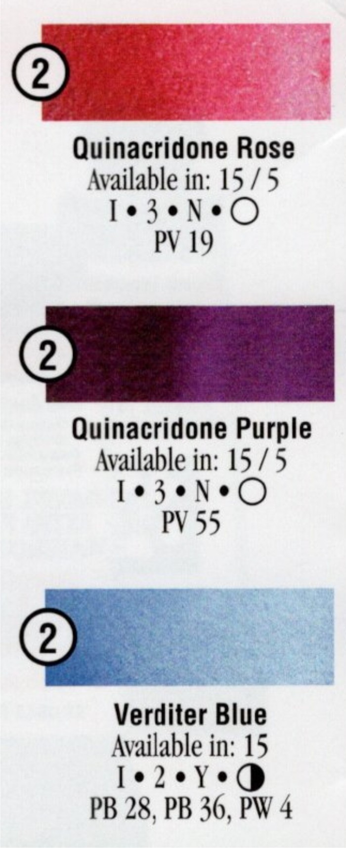
3. Using colors that only have one pigment in the paint instead of 2 or 3 can help you achieve brighter or more vibrant color mixes. An example - Cobalt is made of one pigment - PB 28*, while Permanent Alizeran Crimson Hue has 3 pigments - PR 177, PV19, PR 149 (*see note below for info on pigments). So, if I make a mix with Cobalt and Perm. Alizeran Crimson, I am actually mixing 4 different pigments, not just 2. Then if I decide to add another color to the mix, I now have at least 5 pigments involved. (*Pigments are designated with letters and numbers. The ‘P’ is always used to indicate pigment, then the other letters indicate the family the pigment comes from. So, ‘R’ is red, “B” is blue, ‘Y’ is yellow, ‘V’ is violet, ‘O’ is orange, ‘G’ is green, ‘Br’ is brown, ‘W’ is white, and ‘Bk’ is black. The official definition of the number part of the name is - generic index number that identifies it chemically, regardless of proprietary and historic names.)

color-theory-example-color-chart-Daniel-Smith.jpg

Some brands of watercolor will have the pigments in each paint listed on the tube or on a color chart for that brand. (I only have a few paints on my palette now that have more than one pigment in them.)

There are other properties like staining vs non-staining, granular vs non-granular, etc. for each pigment. The color charts usually have a key that tells you how to read the information. These properties don’t necessarily affect how vibrant a pigment or mix will be, but it is good information to know.

Example color chart info from Daniel Smith. (you can find some color charts online by Googling “paint brand and watercolor chart):

4. When you are brushing the paint onto your paper, the less brushing back and forth you do, the better. When applying the paint, I try to skim it across the surface and leave it. Brushing back and forth a lot in an area can cause the paint to be duller. Also, it can mar the surface of the paper, causing it to look dull. If you want to add color, or adjust an area, it is usually better to let it dry and come back later with another layer.

5. To darken a color and keep it vibrant, start by using a color in the same color family. For instance to darken a green add a darker green to the 1st paint. If that is still not dark enough then use a paint from a family that is next to green - which would be blue.

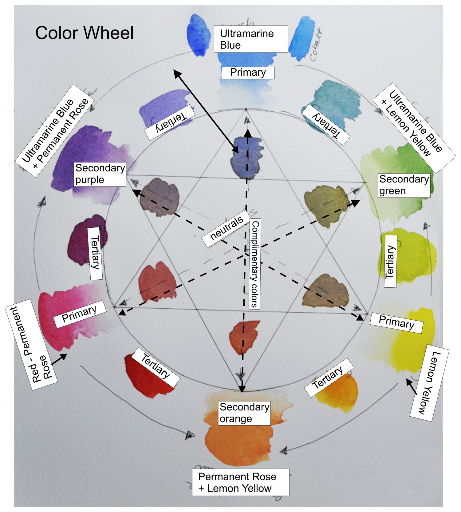
Example Color Wheel. There are many other options to create a color wheel.

Example Color Wheel. There are many other options to create a color wheel.

6. When mixing colors - always think of the color wheel. The primaries are yellow, red, & blue. The secondaries are orange, green, & purple. Tertiary colors are mixes made from a primary color and a secondary color. When you mix colors across the color wheel you are mixing complimentary colors and these mixes will be more neutral or ‘grayed down’. Complimentary colors are: blue and orange, green and red, and yellow and purple.

mixing-vibrant-colors-split-primary-color-wheel-Lorraine-watry.jpg

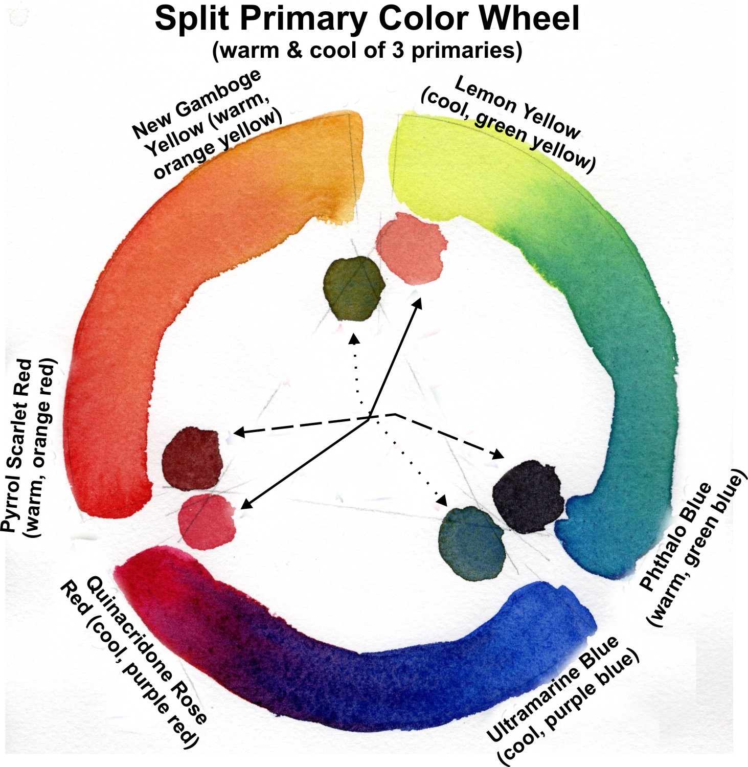
7. Color families are red, yellow, blue, green, orange, and purple. Each of these color families have colors that are cooler and warmer. Ex. in the red color family, Quinacridone Rose is a cooler red than Cadmium Red. So, if I mix a warmer red (leans toward orange) with a blue, the resulting purple mix will not be as vibrant because the warm red and blue are almost complimentary colors. Mixing two primaries that lean toward the same secondary will more likely create a vibrant mix. Ex. Lemon Yellow & Phthalo blue both lean toward green.

mixing-vibrant-colors-Example-color-mixing-chart-Lorraine-Watry

When trying to make a vibrant mix think about the above factors. If the color you get from the mix does not look very bright or vibrant, then you may need to investigate and make an adjustment in the pigments you are using to make the mix.

Hint: taking the time to make a color chart of the colors you are thinking of using in a painting can help you understand what kind of mixes you will get - Vibrant or Neutral.

For more Color Theory information check out this post “Understanding Color Theory” - Design Wizard