In 2015 I was asked by author, Pauline Hawkins, to create the illustrations for a children's book that she wrote when her daughter was little. We started the process and then both our lives got busy and now we're getting back to it. I will be creating 17 watercolor illustrations to tell the story from the blankets point of view. The blanket is a metaphor representing the love of mothers for their children. As the child grows she needs her blanket less and less, but the blanket will always be there for her, protecting and loving her.
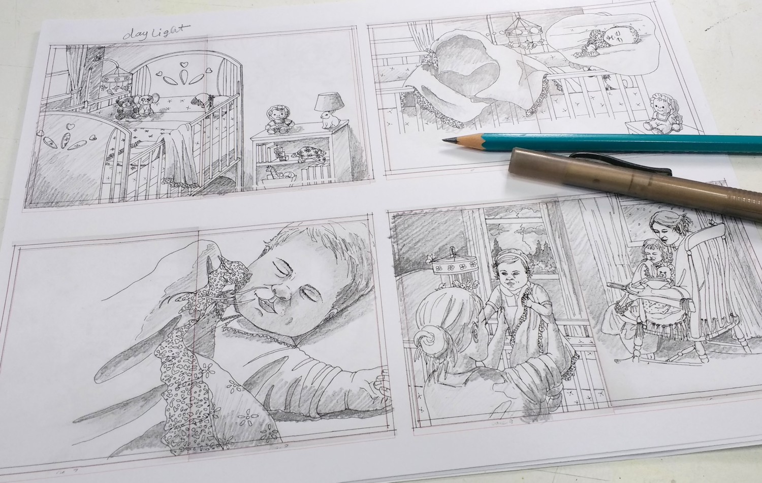
I have not created illustrations for a children’s book before, so I am learning as I go. I started with small mock-ups, about 2 1/2” x 3 1/2”, to sketch the story out. Pauline has modified the story a few times now, so a few of the images have changed or were deleted. Since I will be painting the illustrations with watercolor, I wanted to make sure the drawings are exact before starting the paintings. Watercolor is not an easy medium to make changes to. Changes are possible, but if I can avoid having to make adjustments, that would be preferred.
I asked Pauline for images of her daughter when she was little and the little girl is a combination of her daughter and some images of my daughter. I also looked up poses to use for some of the illustrations since I didn’t have photos of the actual scenes. The stuffed animals that inhabit the little girls room are from Pauline’s two kids and my three kids. I enjoyed placing them around the scenes as secondary characters. I also decided to include a butterfly in almost every scene for the young readers to search for when reading the book.

Images drawn on Borden & Riley Paper and inked
I wanted to keep the illustrations interesting, so some of the scenes are viewed from overhead or from a lower or higher perspective. After doing the initial sketches, I began drawing the images full size 9”h x 7”w for a single page or 9”h x 14” for a double spread (23 x 18 cm or 23 x 36 cm). I draw on Borden and Riley, #234 Bleed Proof Paper for pens because I like the weight of it and it doesn’t smear when I run my hand across it. After I finished the drawings and started inking them in so that the lines would be dark enough to transfer to my watercolor paper using a light table.
This is also my process when I do any of my watercolor paintings. It might take longer to create the drawing, ink it, and then transfer it, but there are several reasons why I do this.
1. I do my drawing on a separate piece of paper because I can erase and make changes before transferring it to my watercolor paper. It is better not to erase a lot on watercolor paper so that you don’t damage the surface.
2. By doing the drawing on a separate piece of paper, I can easily re-draw the image if I have an issue while creating the painting or if I want to enlarge or reduce the image before transferring to the watercolor paper I can do that.
3. Because I have drawn the image three times by the time I have transferred it to my watercolor paper , I sometimes see things I want to adjust and I am more familiar with the image prior to painting.
Small drawings printed out and shaded
For the book, I decided to scan my inked drawings and using my Corel Draw graphics program, I reduced the drawings to fit 4 images per piece of printer paper. Then I printed them out and shaded the images to give myself information on the location of light and shadows in the scenes.

Illustrations printed on watercolor paper
The next thing I did was to print some of the images onto watercolor paper using my Epson WF-4734 printer. This printer uses the Epson Durabright ink. This ink is waterproof so I can paint on top of it without it smearing. I was able to print on some 140lb, Fabriano hot press watercolor paper. It depends on your printer whether it will handle printing on this thicker paper. I then tape the watercolor paper onto some gatorfoam board.
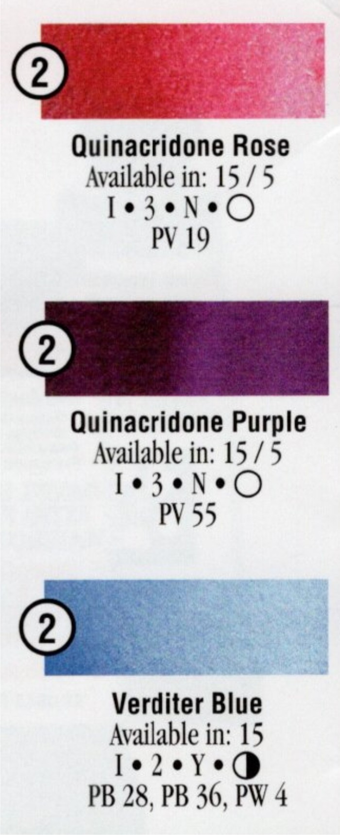
I decided to start with the baby to get an idea of the colors I wanted to use. I tried different color combinations for the babies skin and some some of the materials. The blanket will be a minty green and I decided I like a mix made with Amazonite Genuine by Daniel Smith and Aureolin Yellow to make the green. I didn’t feel the need to do all the shading and values in these color studies, because I will do that on the actual paintings.
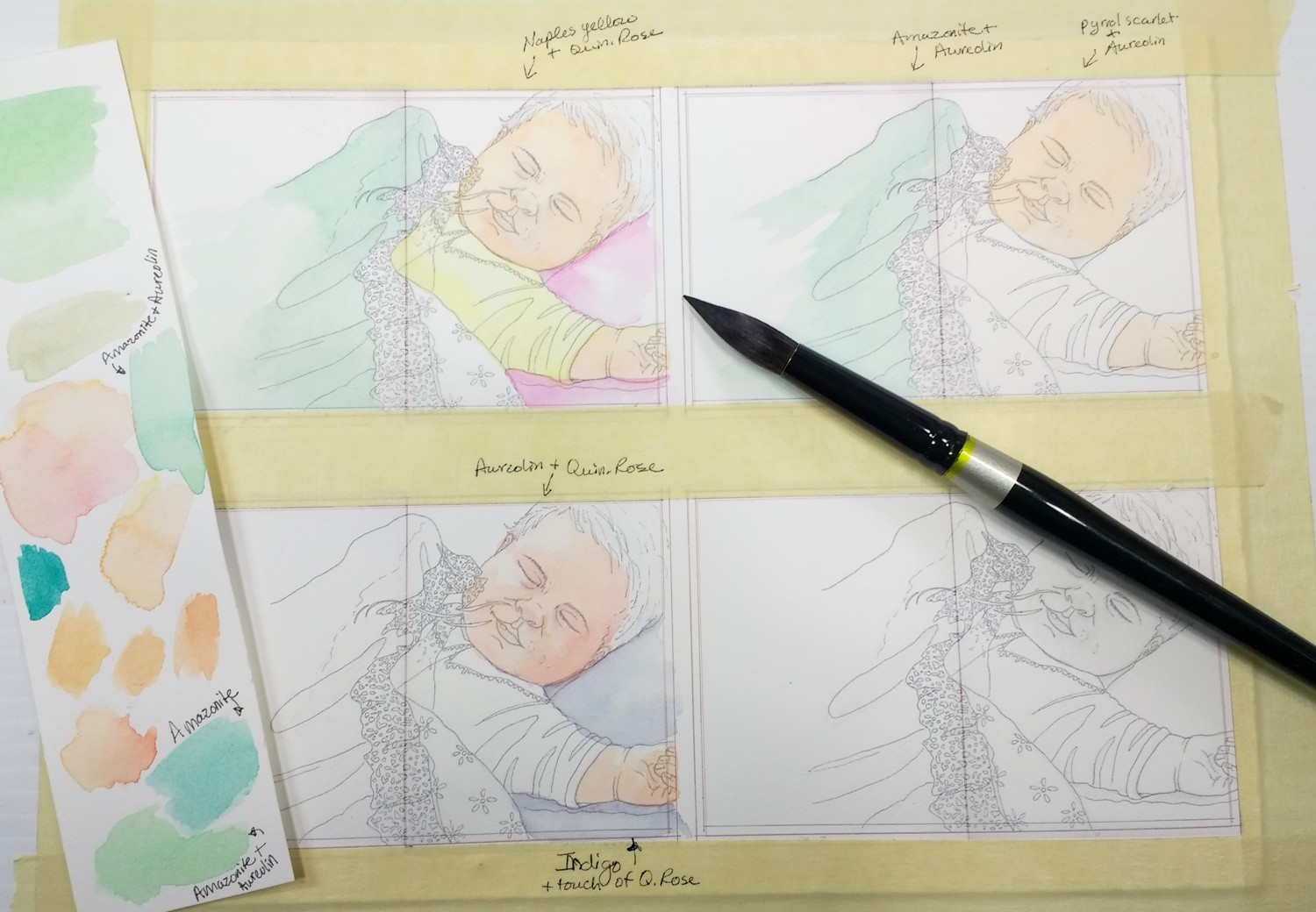
Four versions of the baby color studies
I ended up liking the bottom left version of the baby. I am also trying to decide if I want to use the Fabriano hot-press paper or use Arches cold-press. Normally I paint on Arches 140 lb. cold press paper. I like the fact that Arches is able to handle a lot of techniques including lifting. That might come in very handy if I have to change something in one of the children’s book illustrations. Fabriano is a slightly softer paper and is brighter white. I like the look of it, but I may not be able to use some of the techniques because the surface can tear with rougher techniques. I accidentally dropped some yellow watercolor on the green blanket, but was not concerned about lifting it back off since it is just a study.

Close-up of the baby using Aureolin Yellow and Quin. Rose for pinker skin
Right now, my lines really show. I am trying to decide if I want to use any other medium with the watercolor, like ink or watercolor pencil to give the illustrations a distinct character.
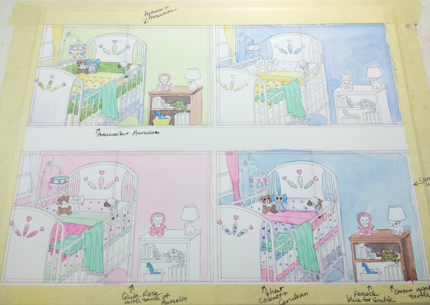
Next, I painted four versions of the babies bedroom to get an idea of the color scheme. I could probably do a dozen versions of the bedroom color scheme, but I ended up liking the warm look of the upper left bedroom with the yellow and green with touches of blue and pink. I explain my process for the bedroom color schemes in the video below.
I will continue to post my process and progress as I work on the illustrations for the book in the next couple of months. So, please check back.